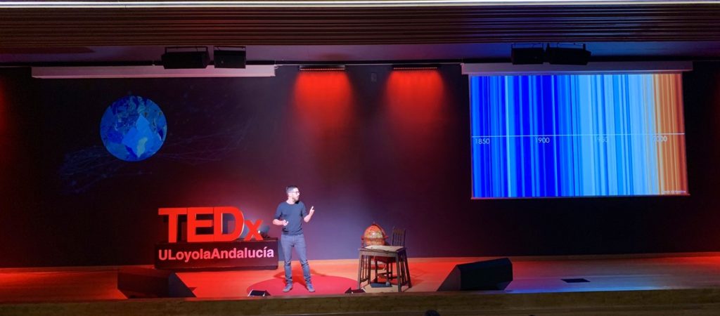
We scientists are used to speak in public, but this was a new dimension of it. Last Saturday, I had the opportunity to talk about Climate Change and our delayed action at TEDxULoyolaAndalucía in Sevilla (Spain). Speakers from very different backgrounds shared their ideas and experiences on the event theme “Turn the world around“, which was inspired by the first circumnavigation of the world by Magellan and Elcano in 1519-1522.
We enjoyed talks that were not only about personal experiences of travelling around the world, but also about how our vision of the world changes with innovative and creative mindsets. Journalism, sports, literature, music, performance, arts and science were some of the speakers’ backgrounds. It was a pleasure to share the stage with such a mix of people, and it was great to talk to an audience so different to what I’m used to.
A world of evidence
In my talk, I showed signs of climate change around the world and reflected on why humans are taking so long to take action. Despite the growing evidence of our impact on the climate and on the environment, we tend to disregard science findings unlike what we do in other disciplines.
I used and edited data visualisations by other scientists such as Ed Hawkins, Emma Reed and Zack Labe to illustrate climate change evidence in a clear and attractive way. The most famous image is probably the warming stripes by Ed Hawkins, which shows the temperature variations over the last century and a half. This awesome example of simple and effective data visualization was perfect to set the frame of what is going on. Global temperature has been rising due to human activity, particularly in the last decades.

Global warming has implications for the entire planet and alters the climate of the Earth in many ways. I discussed the thermal expansion of oceans and the melting of ice caps, which cause the sea level to rise. This animation originally devised by Emma Reed is very illustrative of the consistent sea level rise in the last 140 years. It reminds us a swimming pool filling up.
I also updated and edited this animation originally created by Zack Labe, which clearly shows the reduction of Artic Sea Ice in the last 4 decades. Comparing the last ten years (2010-2019) with the 80s (1980-1989), the annual minimum of sea ice volume in the Artic was reduced by 66%.
These are only a few of the signs of climate change around the world. Other crucial signs of climate change are the ocean acidification, which has a direct impact on marine life, and the expansion of arid regions. The impact of humans on the climate, and more broadly on the natural environment, is undeniable and is visible in many aspects of the climate system. In the talk, I also discussed on this point. Basically, we are constantly disregarding the scientific evidence on the topic. This is in spite of the importance of taking actions now, both individually and as collectivity.
This talk helped me understand the importance of communicating science to broader audiences. Most people want to know more about climate change, and want to hear it from experts. They are curious about how these conclusions are drawn and what exactly is the impact of our activity. I personally had an amazing time telling this story and listening to others’ view on turning the world around. Hope I’ll have more opportunities like this one in the future!
Recent Comments